
This is part of my ongoing series where I’m documenting the development of my serial novel, Razor Mountain. Be forewarned, there are spoilers ahead! You can start from the beginning here.
Last Time
I revised Chapter One, with special attention to the opening. I spent time evaluating options for book covers.
More Book Cover Action
Much like in my writing, I’m finding that making a good book cover is not about the first draft. It’s about revision, revision, revision. I am, admittedly, trying to be cheap and do it myself, instead of dropping cash on the many fine businesses that would be happy to provide professional artists to help me out. I got myself into this mess, and I’ve been doing my best to get myself out of it.
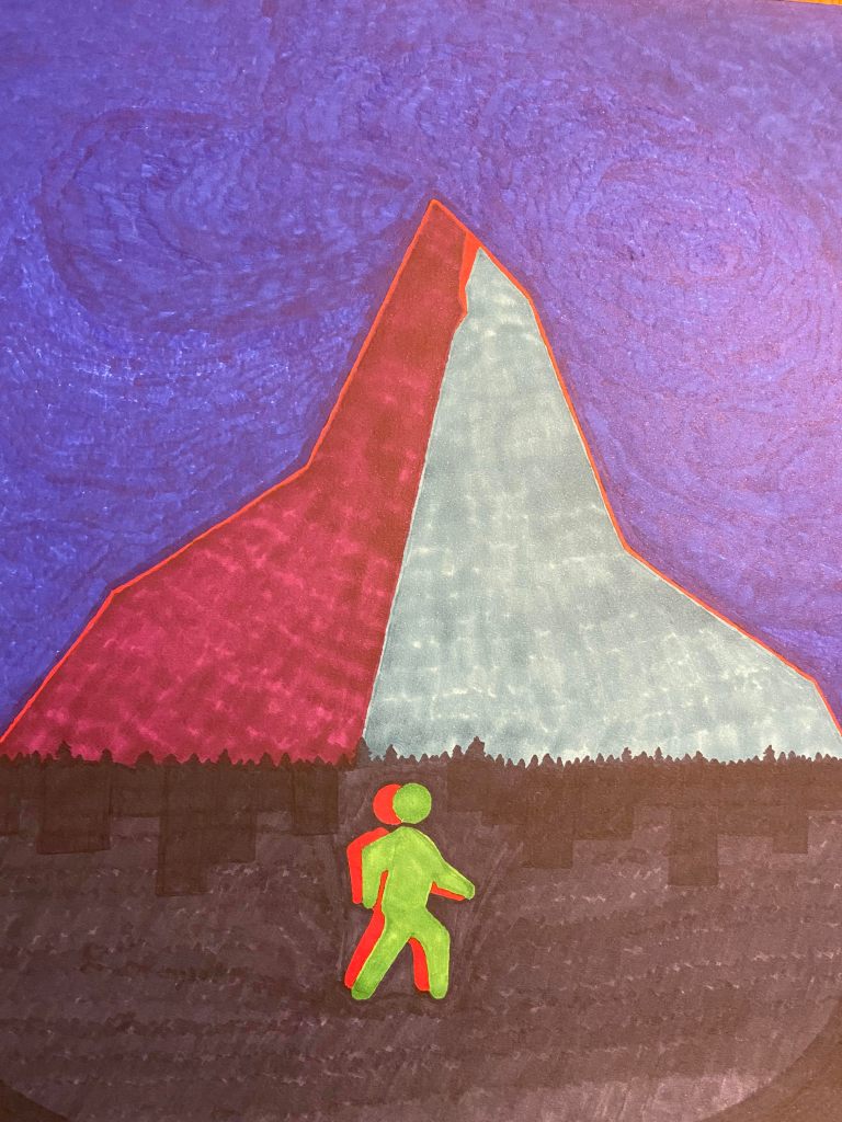
A couple weeks back, I had rough ideas for what a Razor Mountain cover might look like. First and most obvious thing: with a title like that, it pretty much has to have a mountain on the cover. Apart from that, the book is in many ways about duality: past and future, acceptance and denial, life and death, God-Speaker and Christopher. That’s not necessarily an easy concept to get across visually, but I had a vague idea of the mountain being split in half, and the shape of a person in a dark space beneath it, also split or doubled. I imagined a line down the middle, with the regular colors on one side, and a photo-negative effect across the other side.
I continued to think about what I wanted. I looked at lots of book covers. I researched tools and techniques and companies and prices. I wrote a post about it.
I tried creating a prototype by hand, with colored Sharpie felt-tip pens. I enjoy doodling and painting from time to time, but I was not particularly satisfied with the result in this case. It does look slightly better in person — the lighting is bad and the colors are pretty washed-out in this photo — but it’s not something I want to put on the front of my book.
Next, I moved on to Canva. I started by modifying their premade templates. My next cover was certainly better, but it’s a little too simple, with even fewer visual elements than the Sharpie disaster. It also looks a bit outdated, like a paperback cover from the 70s. In retrospect, the font is more of a fantasy font, with a vaguely runic look. Still, this looks like a book cover to me, even if I’m not that excited about it.

I came back a few days later, energized to make another attempt. With some Canva experience under my belt, I trolled through Pexels for royalty-free images of mountains, silhouetted people, cities, etc. I also fired up GIMP (a.k.a. GNU Image Manipulation Program) and did some light editing. I’m hardly a graphic designer, but I’ve played around with GIMP and Photoshop in years past, so I can do some simple things like filters or gradient transparency.
The end result was actually pretty close to my original vision. I spent a surprisingly long time on little tweaks, like the silhouette of hills that separate the top section from the bottom. Fonts are also incredibly difficult to get right. I spent ages flipping between fonts. I still vacillate between this being too cheesy and just right. It definitely feels more like a thriller font.

I also created several different layouts with these same elements slightly rearranged. Unfortunately, different services want square (or even circular-cropped) “cover” images, and in some cases I may want the image without the title and author overlaid, for cases when they already appear in text nearby.
More Revision
I don’t have too many specifics to report on the editing front. I took several more passes through the first two chapters, mostly making small line edits. Now they’re going to my first beta reader, my wife. I’ll be back to looking for more critique partners and beta readers this upcoming week.
Results
I continued revising and editing the first two chapters and I created a book cover that I’m satisfied with.

2 thoughts on “Razor Mountain Development Journal #45”